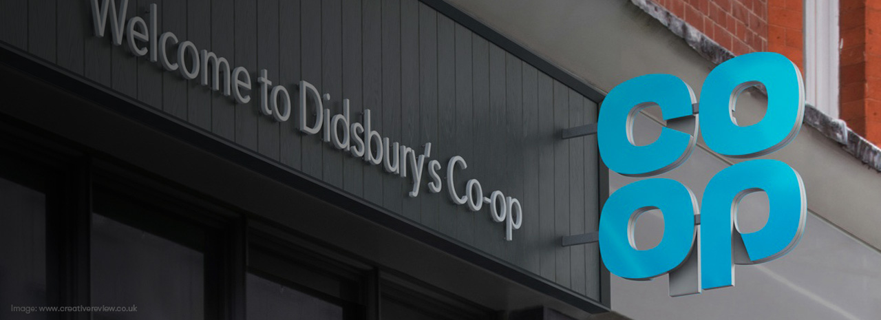
In what may seem an unusual move, design agency Studio North last week unveiled a ‘new’ logo for the 172 year-old retail organisation, Co-op. Yet what might surprise you to hear is that it’s in-fact not new, but a revisit to the company’s classic logotype of the 1960s.
In what seems to be a collaborative and introspective critique into the brand’s history, it is evident that the motivation to look back and revisit a previous iteration of the organisation’s logo is more than just a brand awareness exercise, and is in fact a top-down business strategy, returning to it’s former ‘self’ and re-instating the original brand promise on which it was created.
 (Image credit: North)
Sean Perkins, founder of Studio North, suggested that the Co-op had struggled to define itself as the very thing it was originally founded as: a consumer cooperative where members can benefit from a share of the company’s profits and have involvement in strategic concerns.
A brand that seemed to have lost its way, the Co-op Group has only very recently come through the worst period in its history. According to The Guardian, in 2013-14 the Group lost £2.5bn, the bank alone reporting a loss of £1.3bn. In April 2015, CEO Richard Pennycook announced the end of the Group’s rescue phase as it returned to profit.
Yet in the mid-1980s, the Co-op were pioneers, being the first to use of the ‘traffic light’ system of food labelling, and in 1992 was also the first major retailer in the UK to sell Fairtrade produce. However, John Lewis and Waitrose have since leapt ahead in the consumer’s consciousness, and have both successfully communicated the idea of a ‘partnership’ successfully, while, over the years, the Co-op’s message had become unclear.
Perhaps what is most remarkable about this move is that there is admirable nobility about the decision to say “…you know what, you had a great logo that we can’t really improve on, but we can fix what’s broken and re-connect what was great about your brand”. After all, its every credible agency’s prerogative to ensure their ideas deliver impactful commercial results: something which Sean Perkins himself acknowledges. “It’s a symbol and a wordmark and that’s impossible to beat for a graphic designer. It’s never dated… They did something different and brave and gave people a reason to believe in something. In two years of working on this project, we’ve been trying to get back to that.”
 (Image credit: Creative Review)
Overseen by the Co-op’s Head of Brand and her respective team, the organisation is returning to its classic clover-leaf design which first appeared across shops, produce and dividend stamps in the late 1960s.
An unusual move for any company, the holistic approach taken by North and the Co-op brand ensures, perhaps crucially, that they have addressed the company as whole and not, yet again, treated one part. Whilst the Co-op brand has been through a number of iterations in passed times, Sean Perkins believes that the company already had a “trust mark, a passion brand, a timeless classic” in the form of its original clover-leaf logo.
“When the first one was created in 1968, it was designed to bring the businesses together under one identity. And it was originally drawn by hand,” says Perkins. “We created some geometry for it and presented it to the board in 2014. [For that] we brought in a poster campaign with ‘Remember me?’ and the logo on a blue background. It was all about building on what they had”.
 (Image credit: North)
In working on reinstating the 1968 design, North spent time in the Co-op’s archives in Manchester and looked at the original identity manual for the brand, as well as old advertisements and communications material. From there they redrew the logo and developed it across uniforms, packaging, vehicles and building fascia, linking all of the organisation’s concerns together.
Now that the brand has been re-aligned, figuratively speaking, Studio North and the Co-op Group are to begin rolling out the timely classic. The new shop fascia, where possible, will reflect the local environment and be built from more appropriate materials such as wood instead of plastic: further evidence of the fact that Studio North have been integral to what must have been a frank self-affirming shake-up of one of the oldest UK retail organisations.
